I’m not sure what it is about the BBC News website redesign but it makes me feel uncomfortable? Is there too much space around things? Is this a mad thing to say? It definitely works and It must be the most accessible news site on the planet? I really don’t know but somehow the design doesn’t feel right?
Typographic things you never knew….
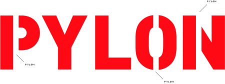
January 10, 2008I thought I knew everything until today when I discovered to my horror that the bit of space that holds the counter in a stencil alphabet didn’t have a name. Well you can rest on your typescale (what’s one of them I here some of you say?) that someone has solved the dilemma and given it the grand name of a ‘pylon’. You can find out more and discuss in detail here.
Antidote
November 20, 2007Serving as a sublime antidote to the ‘consumer Christmas binge’ (below) and the onslaught of the ubiquitous ‘Noddy Holder / Roy Wood / Shakin’ Stevens / Paul McCartney / John & Yoko’ medleys in our stores, I am currently listening to Trio Mediaeval’s ‘Folk Songs’ on my favourite label, ECM: http://www.ecmrecords.com
As an aside: interestingly, whilst perusing the shelves of my local 24-hour Tesco at the weekend, I was aware of their ambient in-house Eno-like soundtrack consisting of a single chord which ‘came and went’, overlayed with subtle bird calls. It lasted for the duration of my shopping visit and was quite acceptable – certainly more than those nauseous, repeated airings of the ‘Best Christmas Album Ever’ (which one shop assistant recently told me would “drive her crackers” by Christmas Eve!)
With this excellently-produced collection of Norwegian a cappella vocals and percussion, Trio Mediaeval definitely win my vote for the perfect way to brighten winter’s dark days. And, of course, with ECM, the music is only half the story – the other being the beautifully designed, collectible packaging.
Flavour of the year
November 15, 2007Admiralty Charts
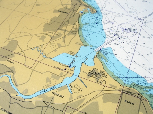
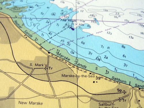
September 9, 2007I’ve got to say I’m a sucker for maps, so some of the posts about cartography at AceJet170 are really enjoyable. I have few old maps but a favorite is a modern British Admiralty map of the North East coast. The colouring on these maps is particularly nice. There is quite an interesting diagram here that shows how the colours on British maps are used. Here are a couple of photos of my own map. John.
On coming war stories in the middle of the road!
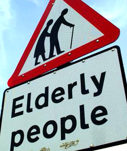
September 5, 2007I caught an item on BBC1 that reminded me of something that’s been bugging me for ages – road signs. It’s hard to believe that today we are still stuck with crude graphic representations to symbolise people, objects and actions. The feature on BBC1 was a complaint about this sign that represents elderly people. There are some quite humorous definitions here. It would be interesting to know how these things come about, who designs them, who approves them etc. I found an interesting explanation from the British Medical Journal of how this particular sign came about, what it stands for and what the diagnosis is:
The traffic sign for elderly or disabled people crossing the road was introduced in the United Kingdom in 1981 after a children’s competition. It portrays a silhouette of a man with a flexed posture using a cane and leading a kyphotic (abnormality of the vertebral column) woman. The same sign is also used for frail, disabled, or blind people, even though many of these people are not old. The sign implies that osteopaenic vertebral collapse and the need for mobility aids are to be expected with physical disability as well as with advancing age.
I think it’s about time for a re-design. If anyone has other gems, we would love to see them. John.


 Posted by John Furnival